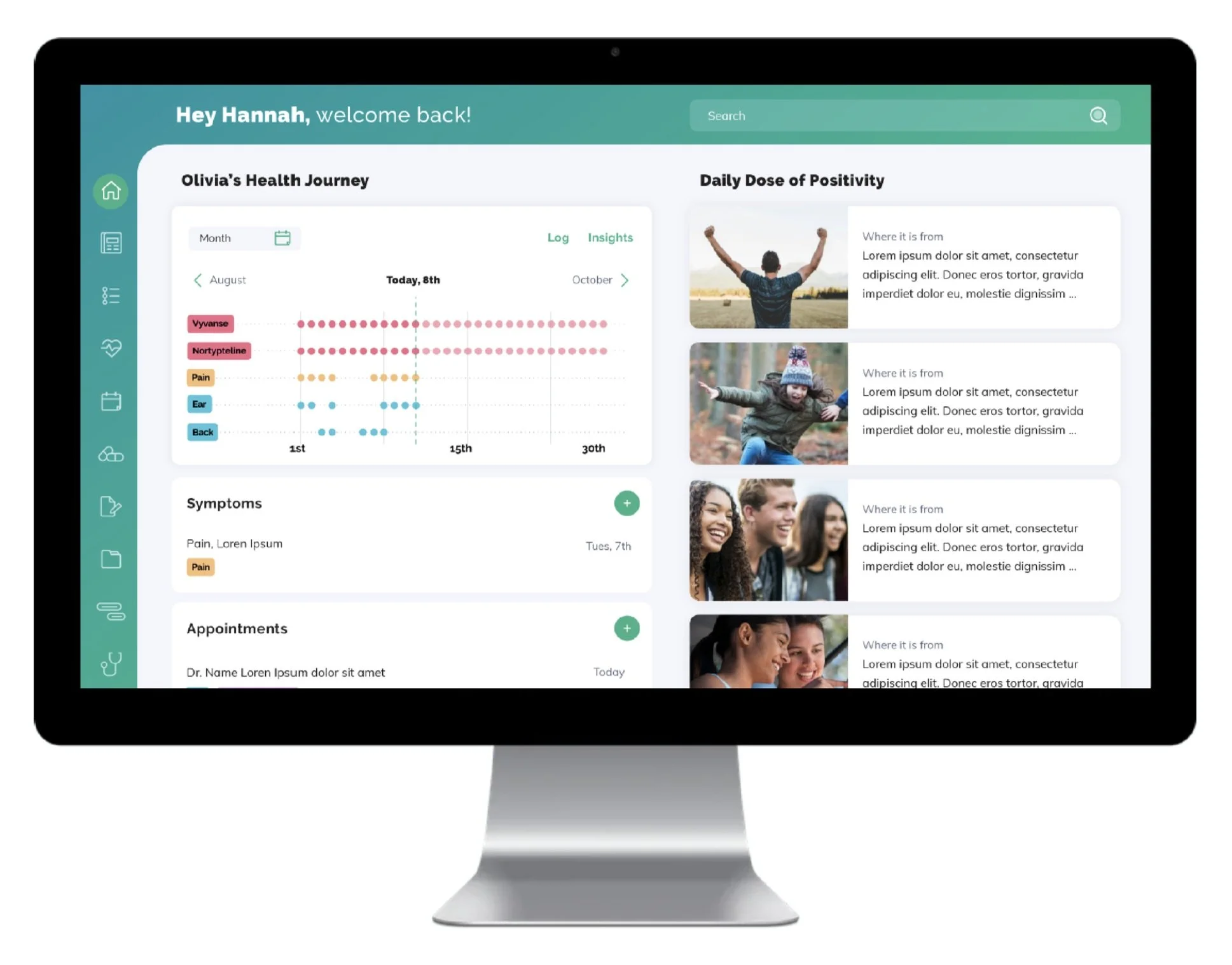
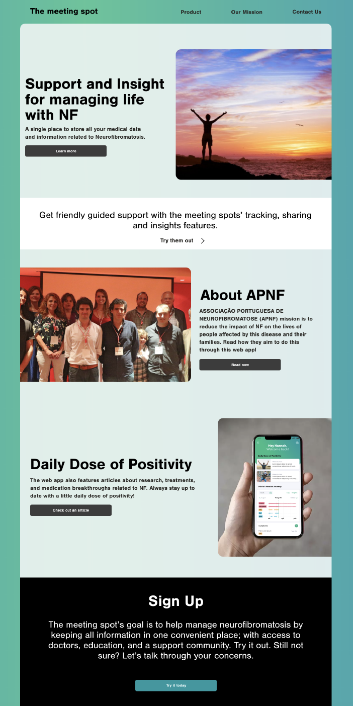
We conceptualized a responsive app for Neurofibromatosis (NF) patients and caregivers to manage and track important information in a singular spot.
Client project
Tasks: research, visual language, navigation, wireframes, task flows, and prototypes
Problem
There currently isn’t a simple solution for Neurofibromatosis (NF) patient medical records. Records are digital and physical and include many medical professionals, depending on the severity, a patient could have upwards of 10 medical professionals they see annually/quarterly. Furthermore, information transferred from one doctor to another gets lost and misconstrued, with the responsibility of information falling on the caregiver.
Added complications are that the disease is sporadic and varies throughout a patient’s life, as well as from patient to patient, making it difficult to track and manage. Associação Portuguesa de Neurofibromatose (APNF) reached out to UE Group to design a solution to combat users pain points.
Get Down With The Research
The first month of this project leaned heavily on analyzing current medical applications and gaining a deeper understanding of the disease. The most notable findings that drove our design were:
Updated NF diagnosis markers decided on in 2020
NF networks; research, treatment, and organizations
Experiences from interviews and patient stories
The UX Must Achieve…
Help doctors get a full understanding of all the factors at play in the patient’s specific case
Provide a way for the caregiver to organize medications, appointments, and therapies
Enable records to be digitized and managed
Help the patient better understand their diagnosis and medical history
Provide resources: finding a new doctor, genetic testing, and knowledge of the disease progress
Site Map, Mobile First
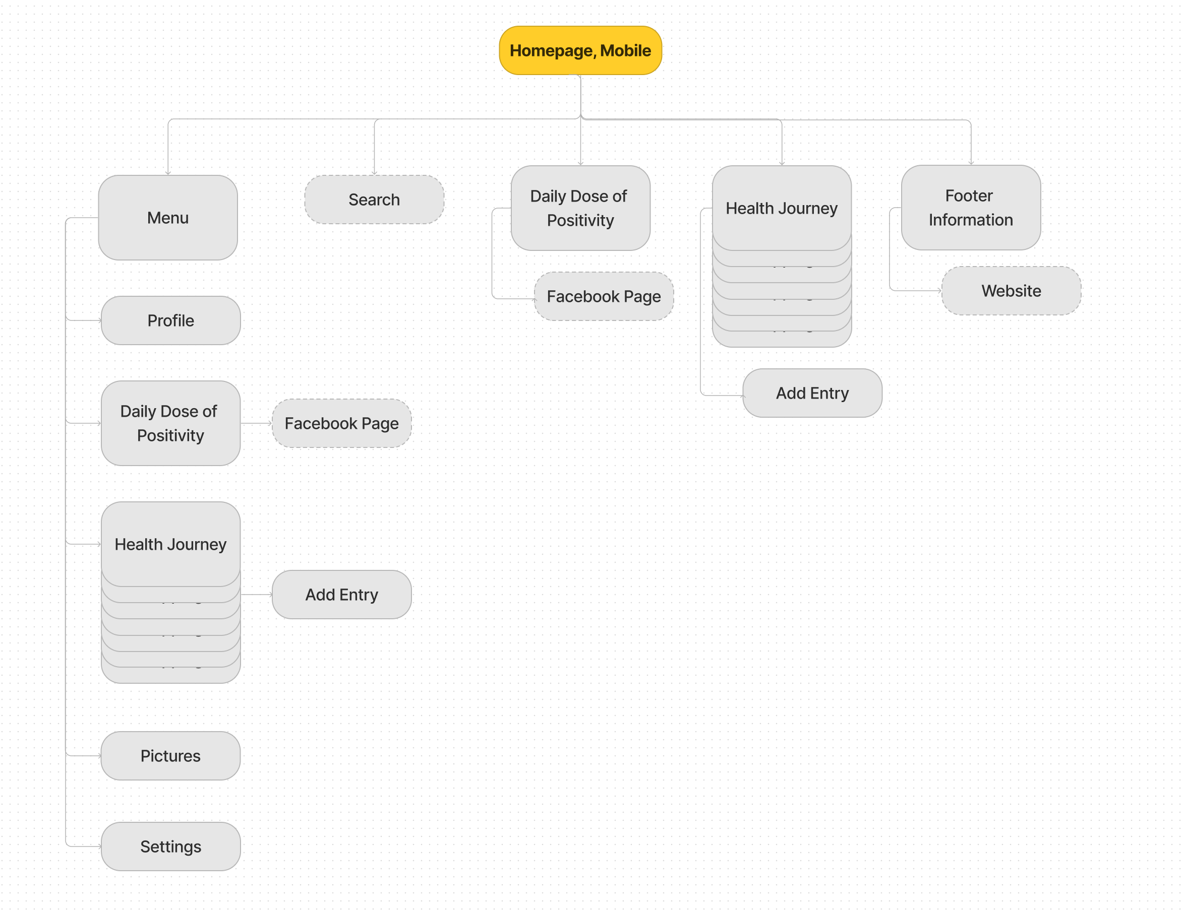
Designing for mobile first we proposed a site map and layout that could easily align with the sidebar navigation of the web-based site. We researched mobile best practices and adopted add buttons on the homepage and menu to help users navigate tasks faster. Our proposed arrangement prioritizes frequently used pages and features but we still have some pages that are TBD and how we link to existing sites, facebook and the APNF website.
Framework: Controls
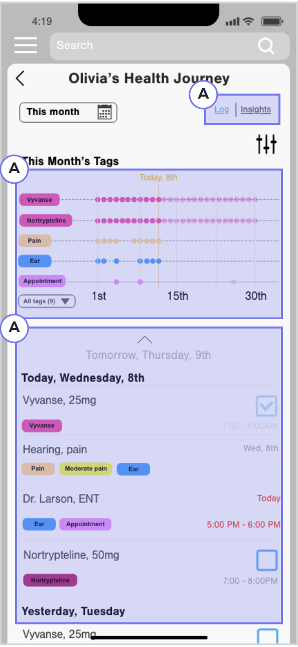
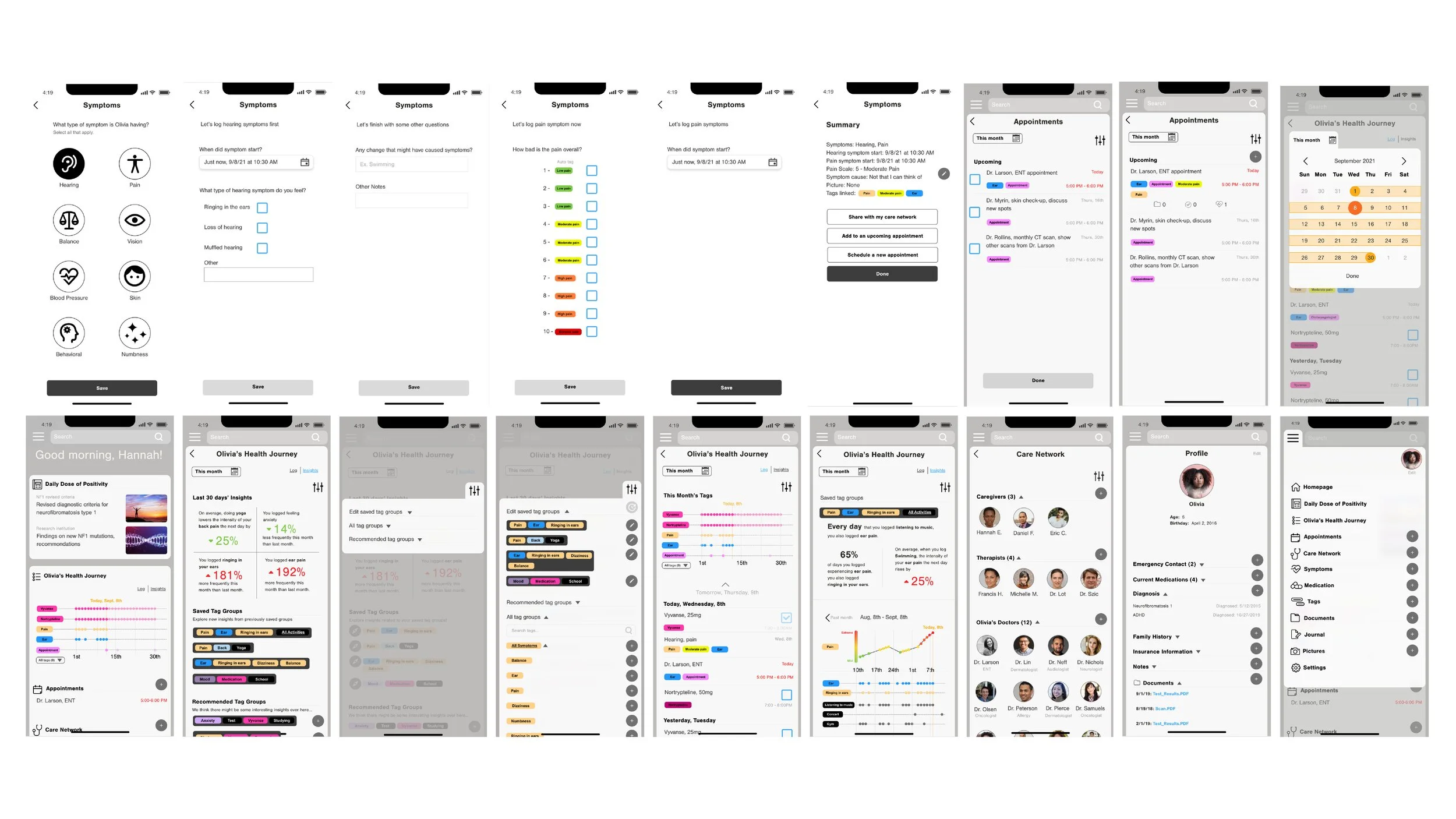
Olivia’s Health Journey page offers an opportunity to see past entries and dig into trends and patterns using tracker groups within the patient’s history.
The log view shows the user chronological entries through a visual timeline and list of entries (daily medication reminders, symptoms, journal entries, etc.), in the recent past, present, and near future (A)
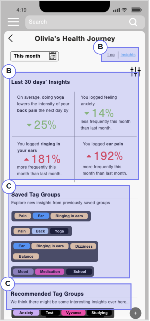
The insights view bubbles up relevant trends and connections in a patient’s health journey (B)
It also guides users towards saved and recommended trackers to group data and see what factors potentially influence symptoms (C)
Task Flow
In this flow, the user, Hannah, adds her child’s symptoms from this morning. This flow demonstrates the ease of adding and organizing entries.
Task Flow Screens
Next Steps:
Test lo-fi layout, task flows, etc. with APNF organization members
Solidify MVP
Make the style guide WGA compliant
Develop a web prototype
Apply compliant style guide to both prototypes
Decide if APNF's current website shares the apps style guide
Share progress in APNF newsletter
Get buy-in from other organizations
The Children’s Cancer Foundation
Potential email brochure for buy-in
*More task flows and explanations to specific pages are available in a separate presentation, email me if you would like to see the full case study.


