Improving Medical Guardian’s app for a caregiver to stay connected with their patient
Current
Proposed
Project sprint My roles: product research, persona, information architecture, service design, content strategy, wireframes, prototype and usability testing
How Personal Emergency Response Services (PERS) are evolving
Personal Emergency Response Services (PERS) are evolving to add more technology into their service. As a leader in this field, Medical Guardian sees the benefits of greater connectivity between caregiver, patient and customer service representatives.
Medical Guardian wants to focus on improving their app for caregivers to stay connected to their patient. For the purpose of this case study, we will call the Patient’s device, “Device Alert Button”.
There’s a major communicating problem after the button is hit!
The Device Alert Button system has two buttons, or features, emergency and non-emergency. Both actions result in a call to customer service to start the help process.
Current app that we are improving to work with product.
The problem is that during this time, the patient and caregiver are left in the dark while customer service puts help services into motion.
We researched the current Device Alert Button and app and conducted online surveys to fully understand Medical Guardians product offerings. We collected user’s thoughts towards using the app and product and the overall experience. One surveyor responded:
“I want to be alerted for emergencies as well as non-emergencies and to be kept in the loop.”
Proposing app functionality to enhance the overall experience with the service
We synthesized our findings from surveys and interviews and created an initial product specification list. We arrived at three major themes:
Viewable communication: Enable all messages, statuses, alerts, etc. to be visible for relevant users. Keeping in mind that there are different levels of user connectivity on the app; caregiver, patient, family, and friends.
Modular: Medical Guardian offers many products for high tech watches to single button pendants. The app should be able to scale features across Medical Guardians’ product line.
Educate, educate, educate: Create a human-centered onboarding experience with helpful content and tutorials available on the app, hopefully decreasing app learnability.
Our Persona the Worried Caregiver
Personality:
Worries
Understanding
Available
Frustrations:
Wants to be kept in the loop
Patient doesn’t always use device
Hard to change level of connectivity
Goals:
Get instant gratification their patient is okay.
Have the option to contact customer service reps
Have the option to send an emergency alert
Visualizing the experience
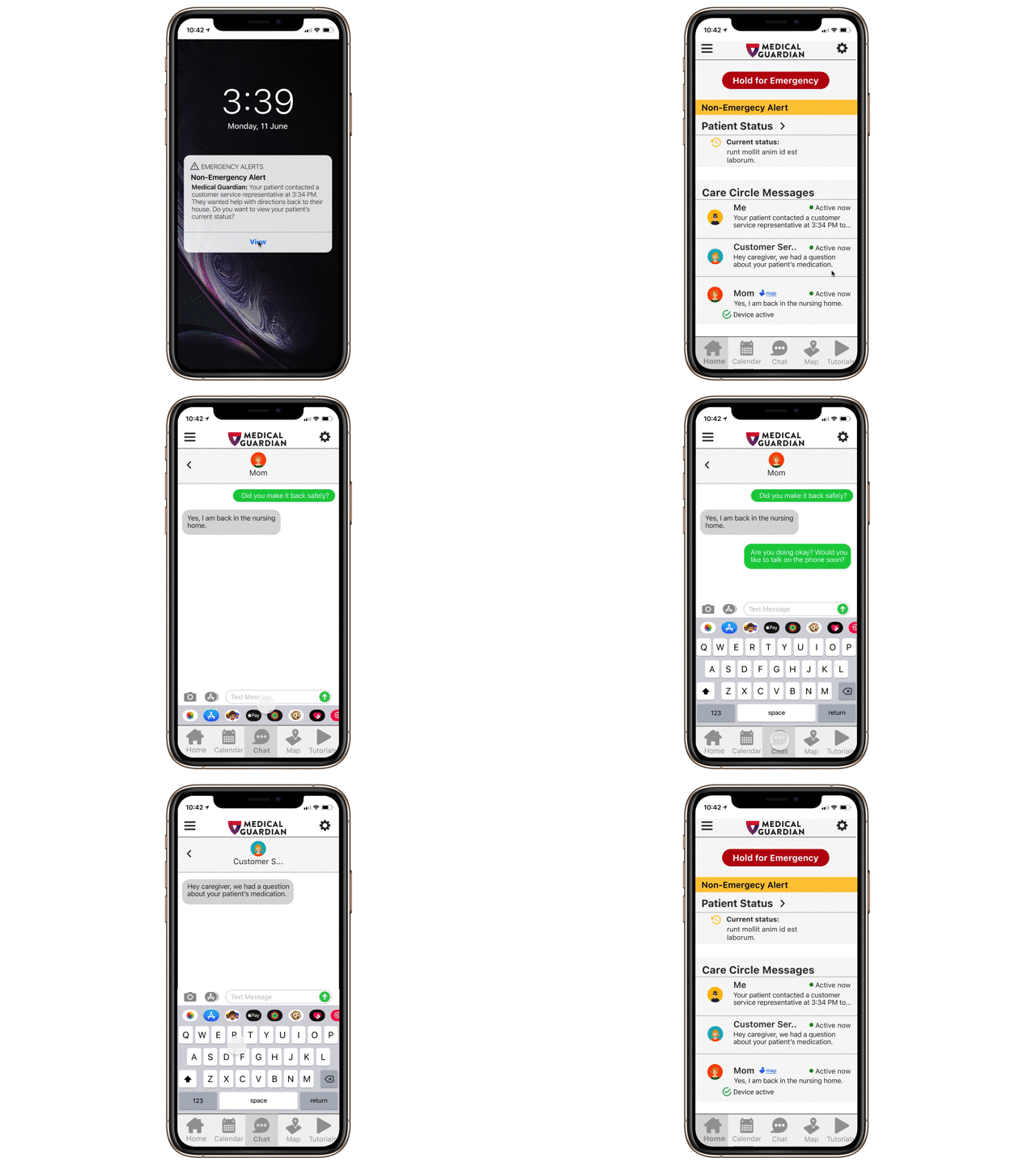
Our three earlier themes directed ideation for prototyping wireframes for the apps information architecture, site map user tasks and other features. Our solutions focused on the two main use cases of communicating throughout an emergency and non-emergency. Below are wireframes of permanent screens during a non-emergency alert.
Worried Caregiver’s main tasks:
View status of patient: The caregiver receives an alert on their phone. They notice it is a non-emergency but want to check the status of their patient. They see that the patient is back at their nursing home but wants to check that they are okay.
Send a message to the patient: Send a message to see how the patient is doing. See if they want to talk on the phone.
Send a message to the customer service rep: After talking to the patient on the phone the worried caregiver reaches out with their praise from the patient on how well customer service representative helped out.
The results are in!
I conducted usability tests with a mid-fidelity prototype that revealed insights to change the homepage’s hierarchy. The user testing showed that the status information and messaging features were navigated to the most when using the app.
The emergency button was not tested for because it is not a main feature for the caregiver. *The testers did enjoy the emergency button being on the homepage in an instance that they are with the patient and something occurred. This prompted us to move the emergency button out of the thumb mapping zone tested by other usability testing in the industry.
Thumb zone
Next steps: A great app cannot be used if its use is poorly explained
Our users are not early adopters. An onboarding process can ease their learning curve. I recommend Medical Guardian implements these features next.
Create and test onboard with the newly proposed changes to the app and service.
Build out a calendar feature to be able to create alerts and events.
Create a map feature similar to find my friends to accompany the app to see who is closest in the case of an emergency.


