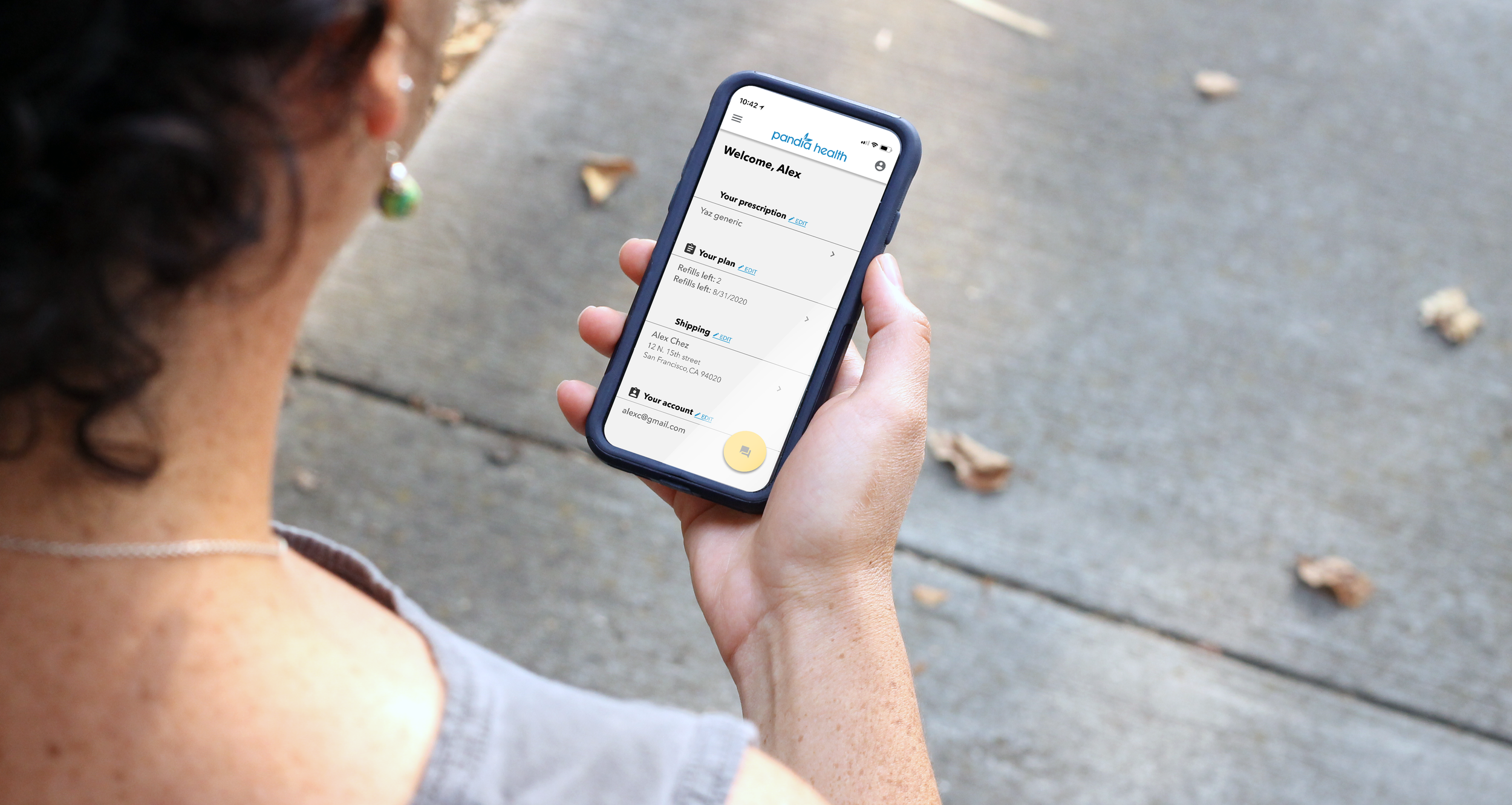
Design a responsive application for Pandia Health
My Role: Heuristics Evaluation, Site Architecture and Usability Testing
Project: Responsive Application
Tools: Figma, Sketchbook, Miro
Resource: Basic HIPAA Training
Deliverables: Heuristics Evaluation, User Workflows, Site Architecture, Wireframes, Prototype, and Usability Testing
Project Overview
As a design consultant, I collaborated with a team on a four-week project for Pandia Health, a women's health and contraception company based in the Bay Area. We designed a responsive app to address user pain points, using research and assumptions as a guide.
The Challenge
Pandia has noticed a significant drop in patient retention over the past 6 months. They want to know what direction to take while designing an app. They have asked our team to deliver a concept to test if the direction has traction with users. Initial questions we aim to solve during research.
How might we find more user pain points?
How might we understand the cause of the drop in user retention rate?
How might we design usability testing to target the younger female market?
How might we quantify a successful prototype?
The Solution
After conducting market research, analyzing existing site architecture, defining workflows, consulting stakeholders, and conducting surveys, my team and I identified common workflows that users perform within our product. We found that users’ main requirement for a mobile app was reminder notifications and ease of editing basic information.
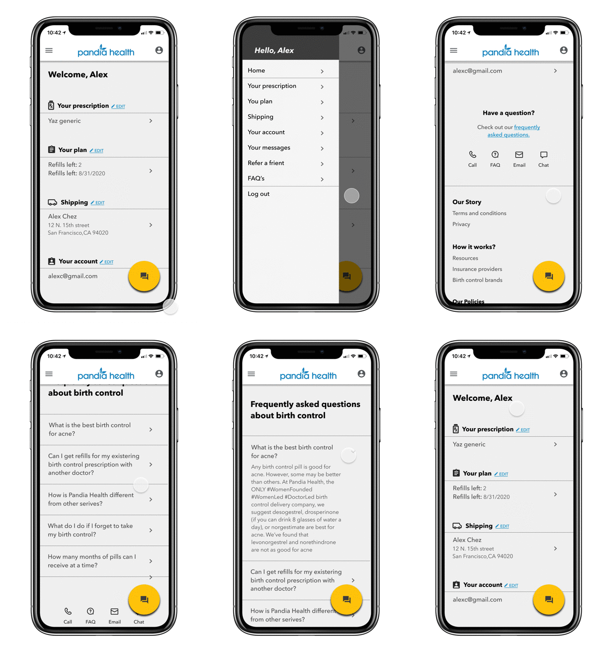
Based on these insights, we focused on revamping the information architecture of the website to align more with the direction of the mobile application. We approached the business requirement for a responsive design with a mobile-first perspective, catering to the way Gen Z users prefer to connect with Pandia’s product.
Current vs Proposed
Process Highlights
Existing Product Analysis
We used product analysis as a deliverable and to align with stakeholders on the strategy for the product. Some best practices that we pointed out were:
Be careful moving main workflows into a hamburger menu
Have similar navigation and design elements throughout both apps; page structure, buttons
Have consistent icons; chat, profile
Research
We chose two research methods; surveys and experience mapping to understand the user’s tasks better. The survey results solidified Pandia’s assumption that developing a mobile app would be beneficial and that workflows should exist on mobile. Ease of use and confidentiality were factors we discussed.
Experience mapping uncovered that some of our assumptions were incorrect regarding workflows. Specifically tasks involving FAQ and delivery information.
Information Architecture
After solidifying workflows, business needs, and existing features we developed a mobile-first sitemap as a framework for navigation. We proposed features should be ordered by frequency and that infrequent workflows would be deeper in the navigation or located in the hamburger menu.
Proposed Direction
Design screens based on a sitemap for a clickable Figma prototype to be developed and tested (above)
This usability testing will help with understanding the implications of a responsive design (below)
Discuss with the Engineering team
Use the design system we created in Figma as a template for other pages, share it with the Engineering team
Iterate sitemap and features based on usability testing
Reflection
I felt our focus to create a framework for user feedback was achieved. The short time frame made for use of multiple methodologies, but the tasks we completed gave us and many stakeholders insight into future steps. I am confident that prototype development and usability testing will solidify main workflows and answer more assumptions.


